Let’s start with a disclaimer: Not all these flyers were made in 2016, but thanks to how search engines work we were only able to come across them this year. That said, we’ve seen several interesting developments in “best flyer design” practices, namely with what seems to be the waning of pure flat designs and the return of gradients — thankfully in more understated forms.
Here are some of the best flyer design samples we’ve seen from designers and creative agencies this year.
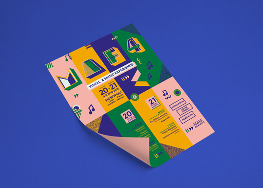
This hip flyer design masterfully pulls off a color palette that not a lot of other designers use.
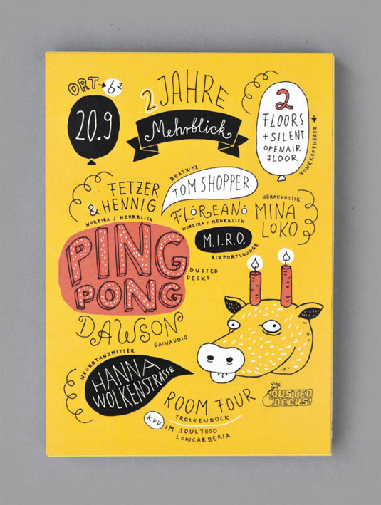
The proliferation of the “middle-school notebook come to life” aesthetic continues to be charming.
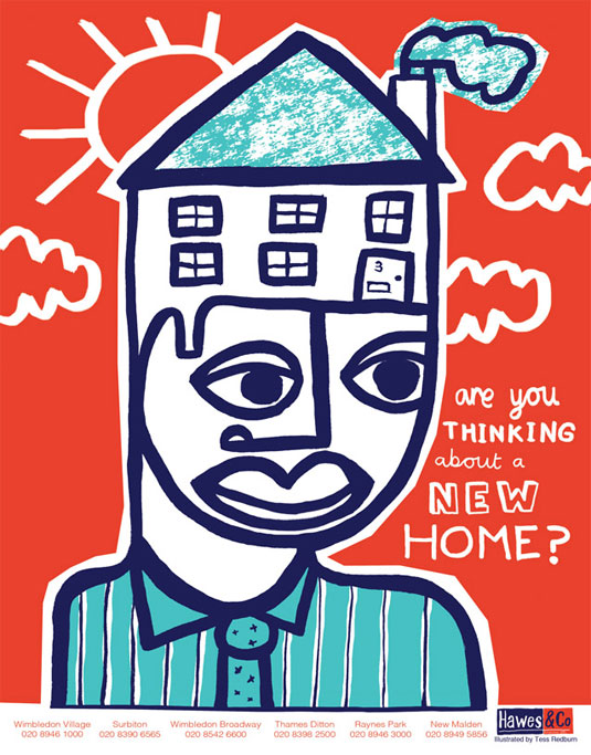
This is likely the most engaging real estate flyer we’ve seen in a long while.
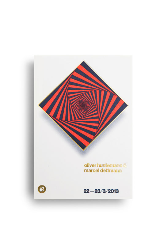
Elaborate patterns and negative space can work together.
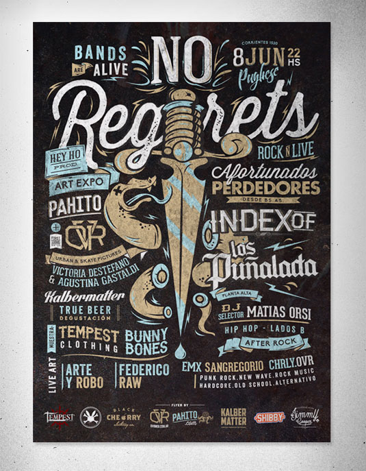
This rather old-school event flyer surprises with a well-executed blend of traditional and modern elements.
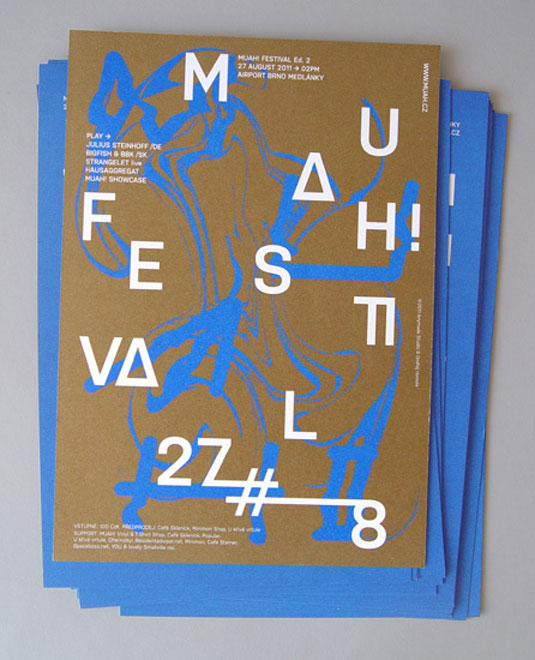
This Czech example manages to be both hip and timeless.

You shouldn’t discount creative use of live elements, even in this digital age.
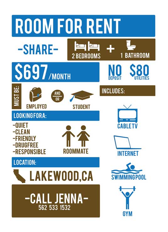
We hope Jenna found a great roommate! This is an incredible approach to a problem many urbanites have.
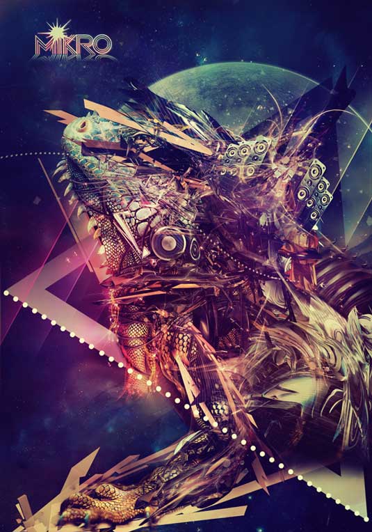
This is an expected look for many nightclub flyers, but this example takes the complexity to a different level.
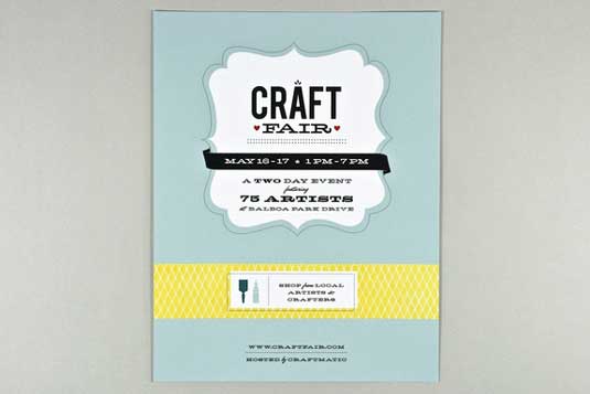
“Tasteful kitsch,” if such a thing is possible.
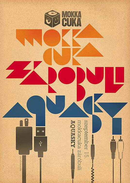
Audiophiles and musicians alike might get a kick out of this minimalist flyer.
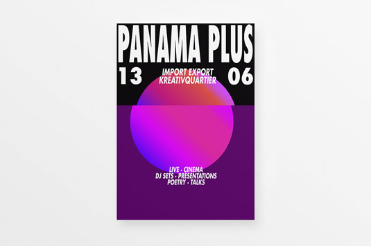
The vaporwave look seems to have arrived in the mainstream this year.
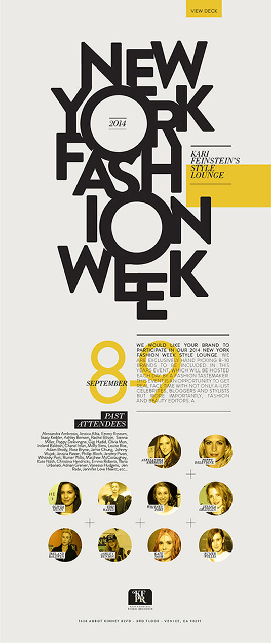
This flyer is a solid piece of information design.
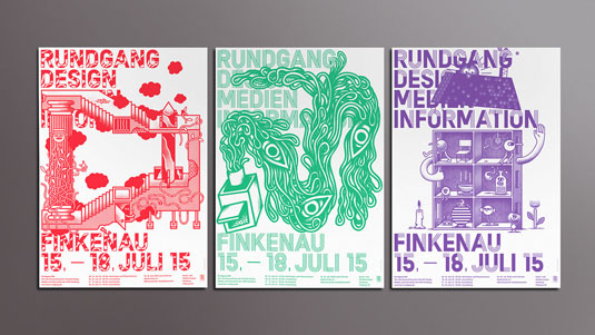
It’s hard to get rid of this kind of minimalist style no matter how sick you might be of it. It just works.
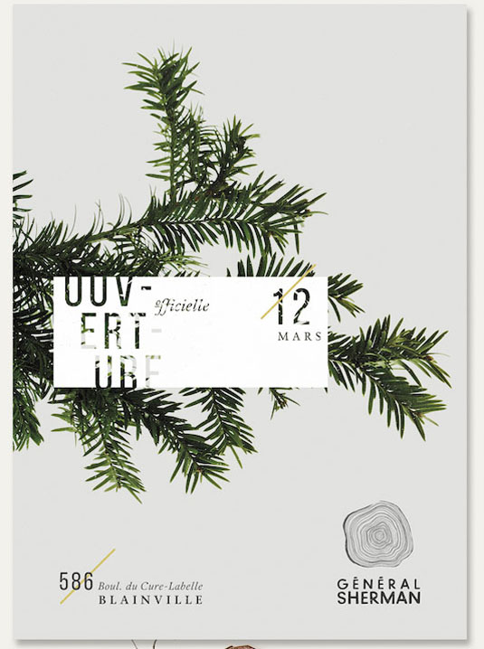
The washed-out aesthetic of old catalogs and other ephemera wasn’t intentional and was mostly due to a limit of old printing technologies. This example combines modern style with a warm, familiar look.
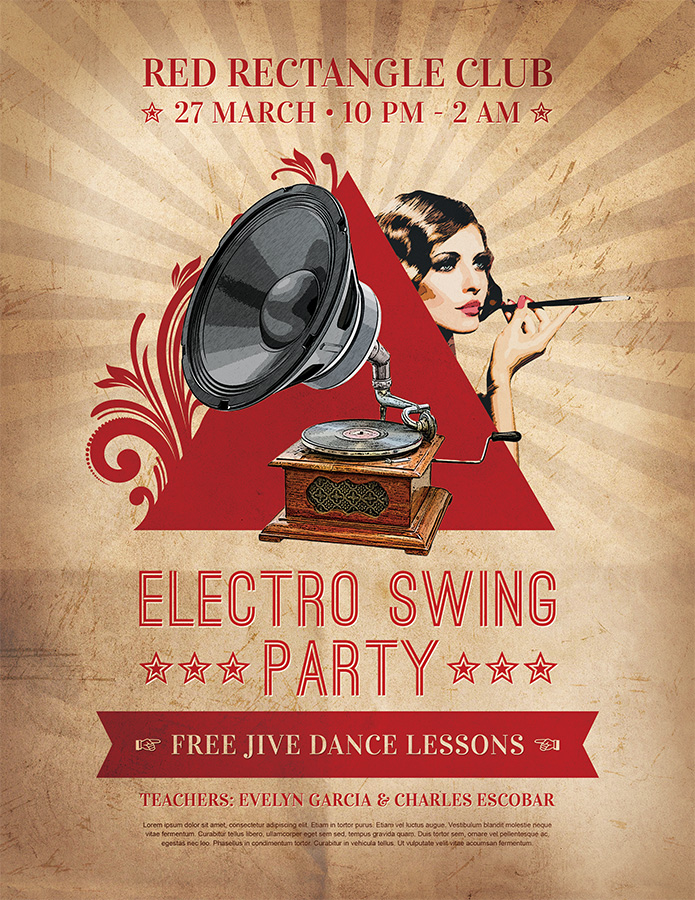
Who says gradients don’t work?
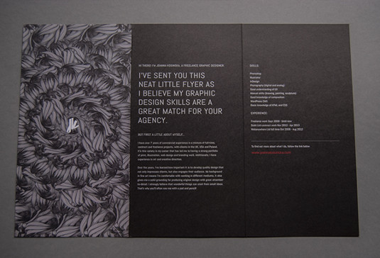
If you’re building a design portfolio, this is how you do it.
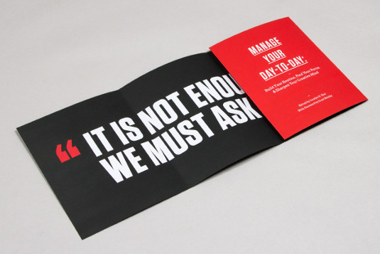
Fold-out flyers aren’t only for more space. They can be used to emphasize one big point.
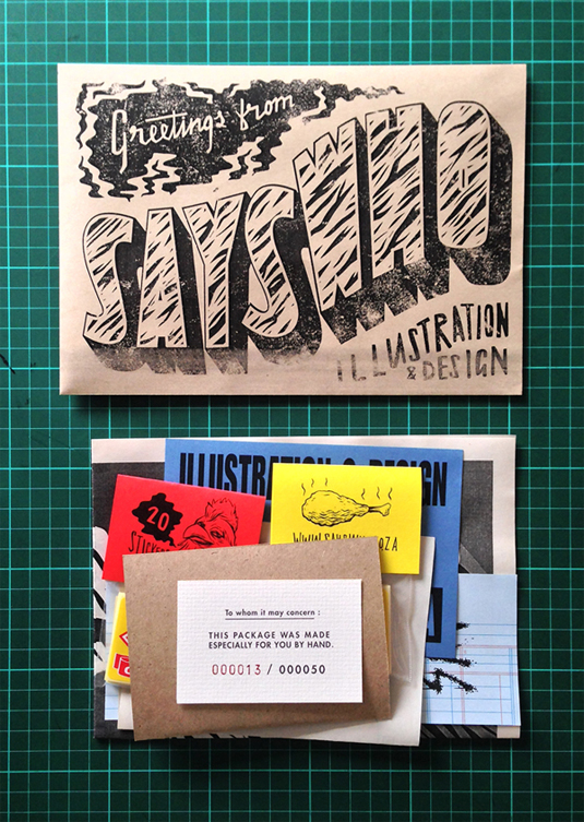
This flyer masquerades as other print materials. Meta design, maybe?
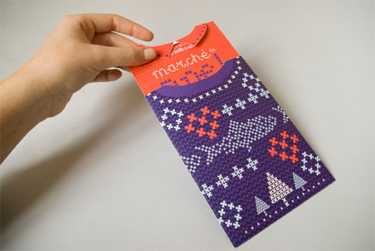
The “lapels” are a great touch.
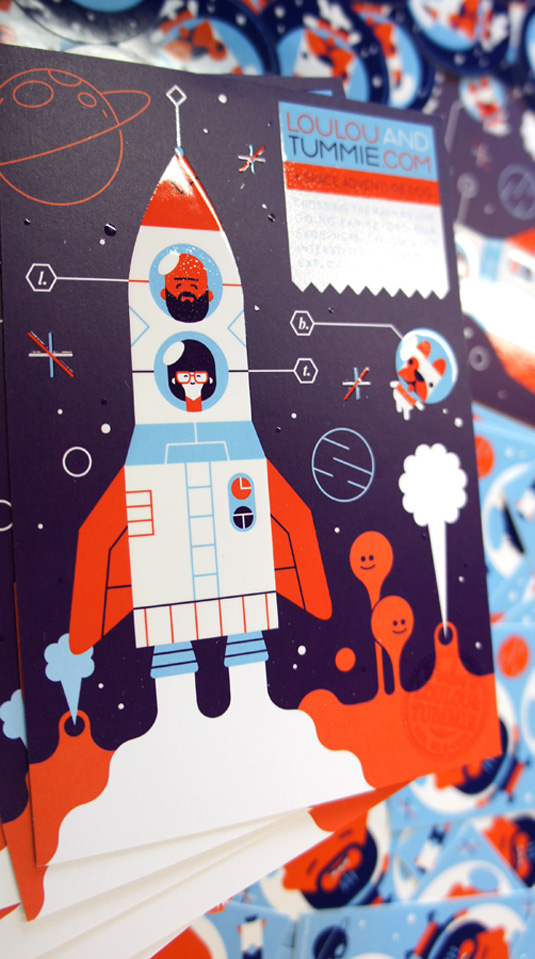
Flat design really shines in the flyer format.
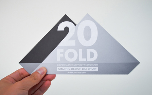
Complex die-cut flyers on cardstock may not always be the cheapest or the simplest to ship — but they sure turn heads.
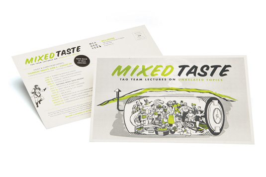
Flyers can also work when oriented horizontally. This example is specifically intended to be used either as a flyer or postcard.
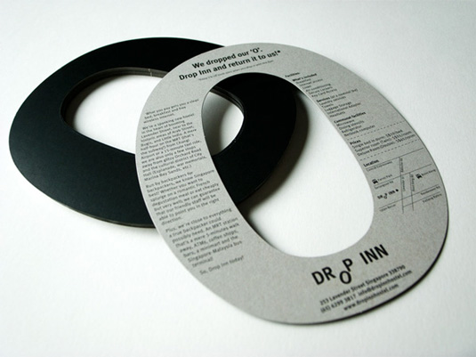
This example from Singapore doubles as a head-turning door hanger.
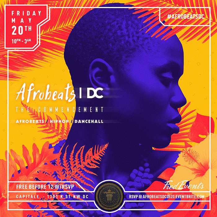
This incredible design incorporates several of the best practices associated with minimalist design, yet isn’t simplistic. Wouldn’t mind owning one of these, just because.
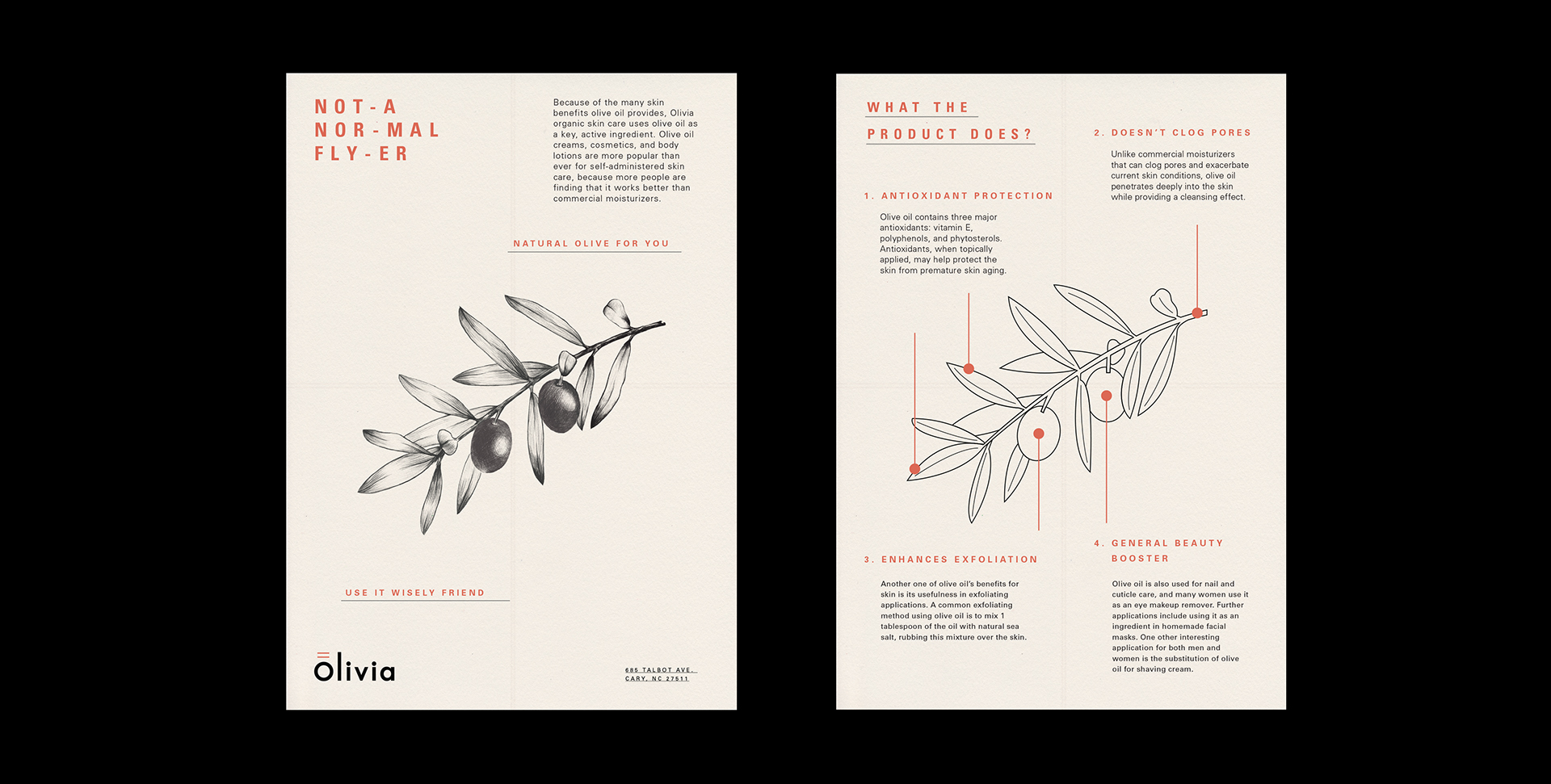
Never thought a flyer design could make olives be this exciting!

This eye-catching promotional flyer by Tower Records for J-Pop singer Kyary Pamyu Pamyu has unexpectedly punk roots.
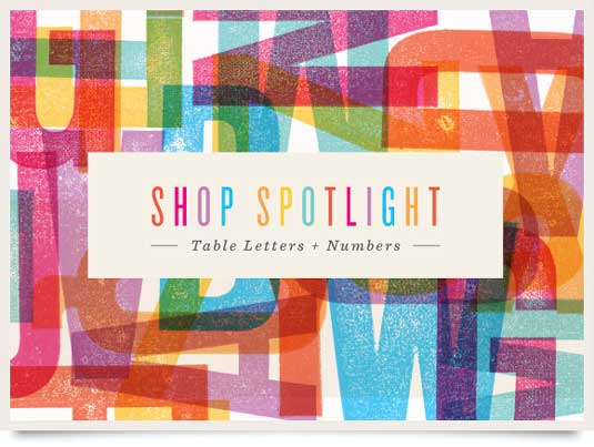
This isn’t exactly what many of us think when we hear the word “timeless”. But this is exactly what this design is. Come back to it in 10 or 20 years and we’ll bet it still works great.
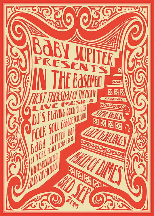
One color design was once borne out of necessity. No one needs to execute these designs anymore, but they can still look great.
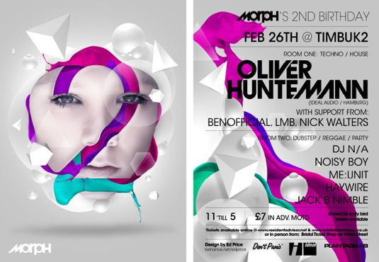
The “techo” look seems ingrained into many nightclub flyer designs. This example manages to avoid looking like everything else, which is saying something.
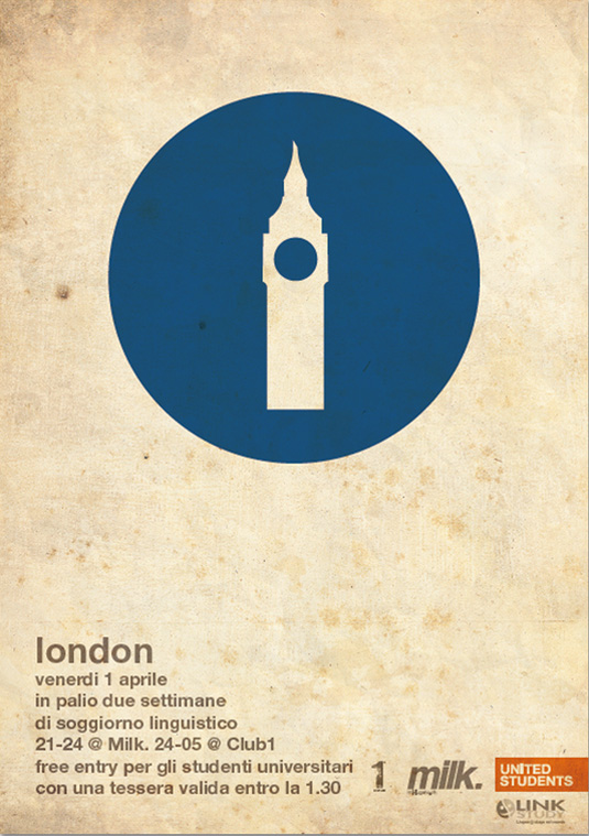
One problem many minimalist designs have is that they are minimal to the point of omitting import info. This flyer does it right.
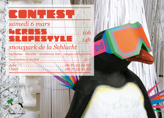
Hey, we like penguins.
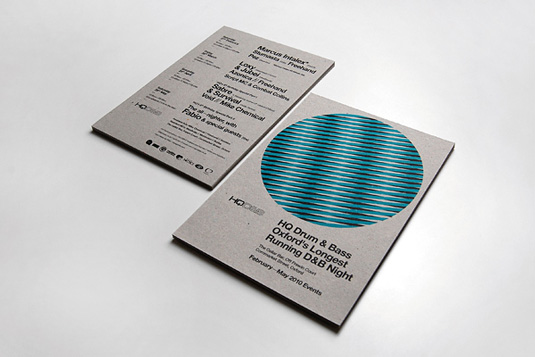
Using a matte stock makes a difference. This design would not work quite as well with a gloss finish.
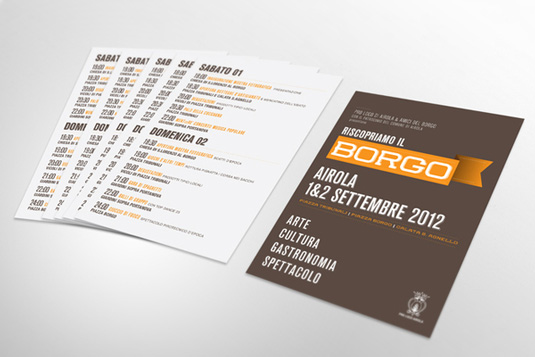
Straightforward design is often the best, especially when lots of important information is involved.
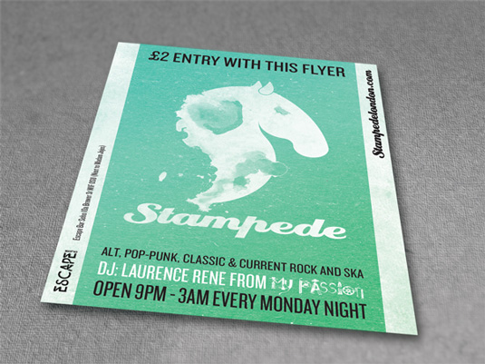
It’s fairly challenging to make these many different fonts work together.
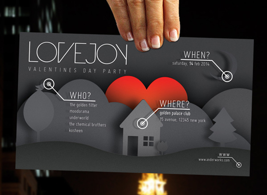
Gradients and flat design can work well together.
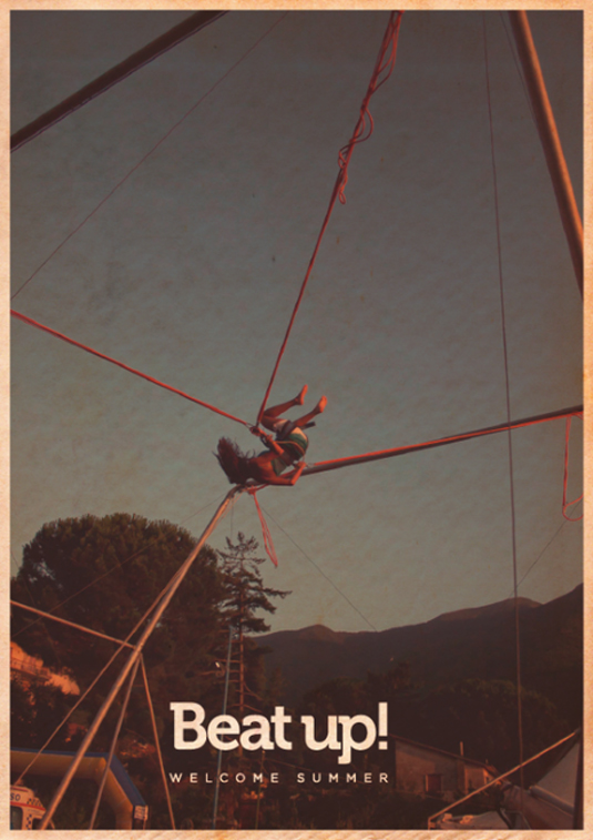
Don’t discount the power of one good photo.
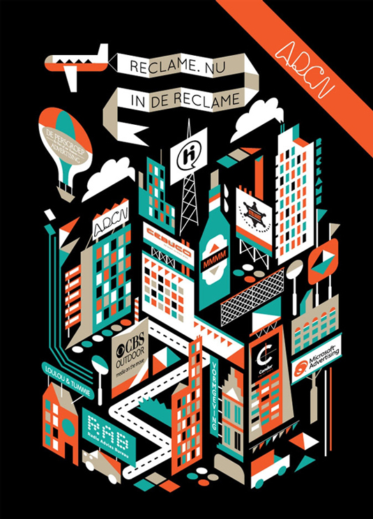 This same concept would be awesome if expanded into a trifold flyer.
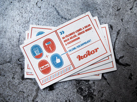
Another standout horizontal flyer design.
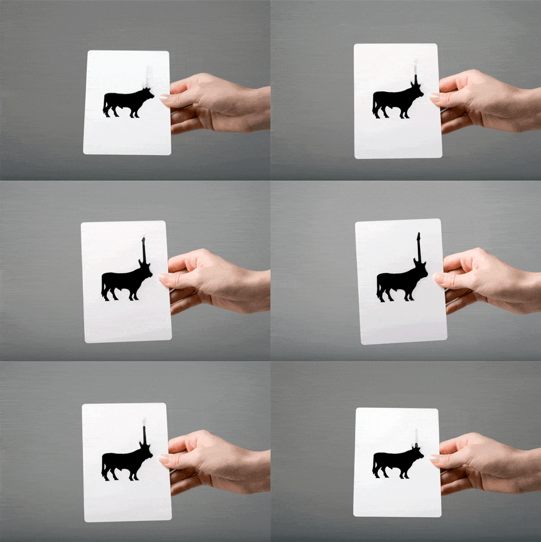
This experimental flyer design uses lenticular printing to create an interesting effect.
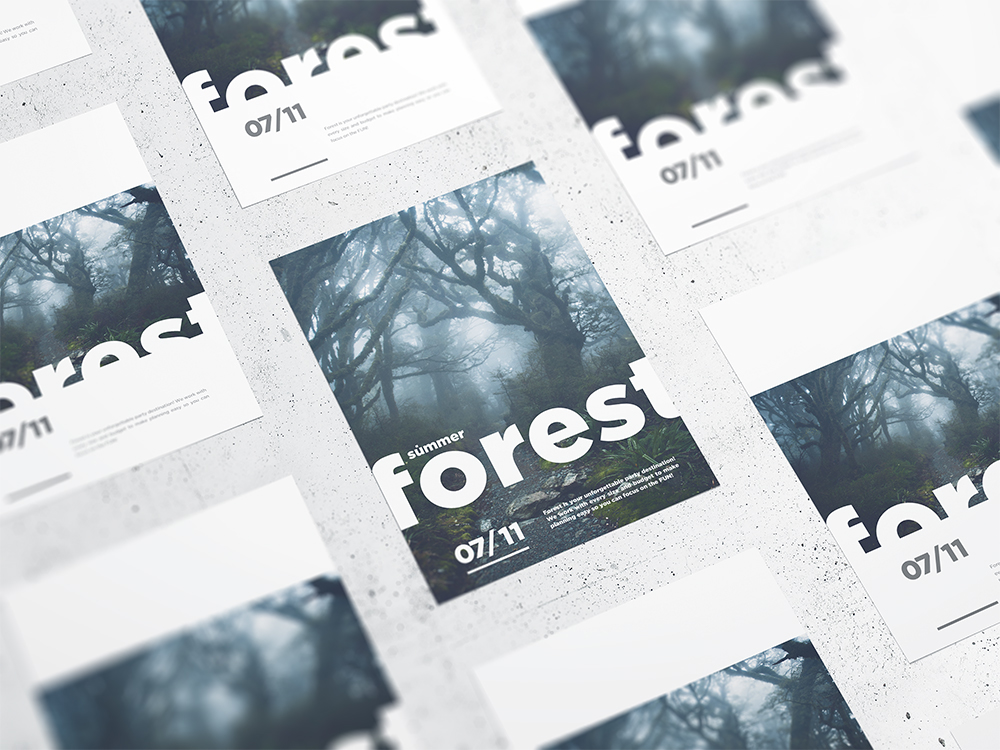
Designs that require accurate edge-to-edge printing are best done through a professional printing service that offers manual proofing.
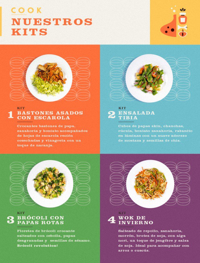
This color palette can get out of hand if you don’t know what you’re doing.
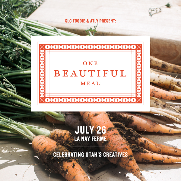
I’m getting hungry.
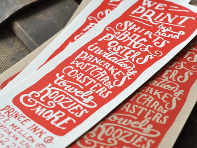
The proportions of this design could easily be transposed onto a bookmark.
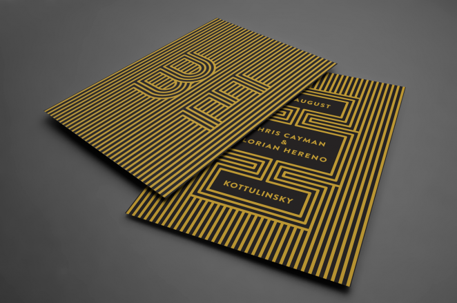
This flyer design calls for some extremely accurate proofing.

This is the best flyer design for contemporary visual design since breaking down images to their geometric basics is a staple.
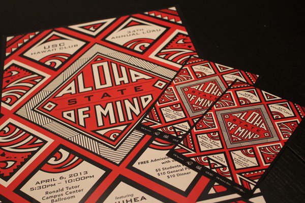
This Hawaiian-themed flyer blends the traditional with the fashionable.
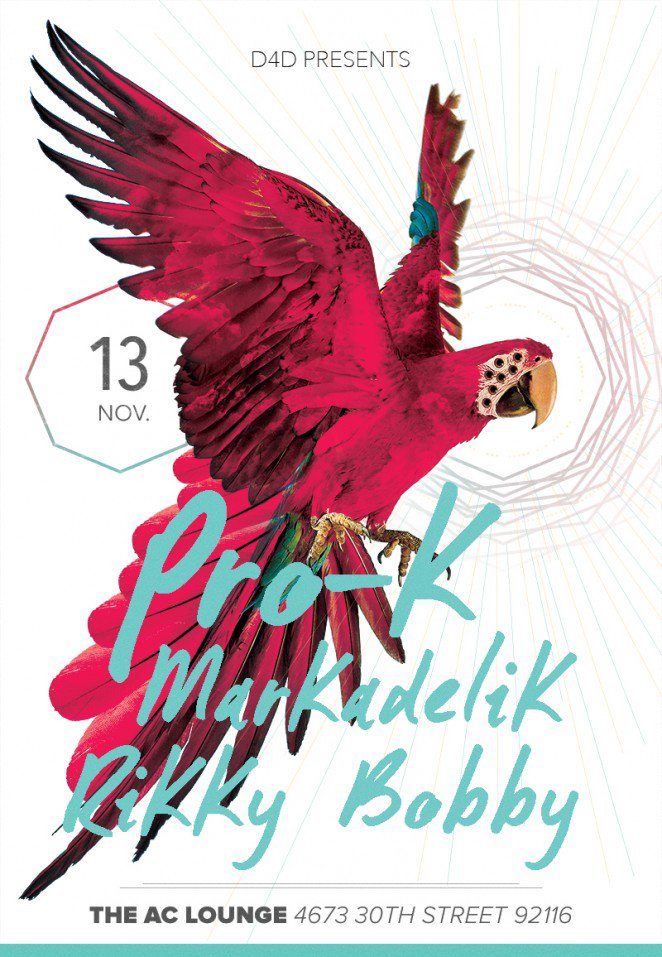
I’d pay to watch this, based on the flyer alone.
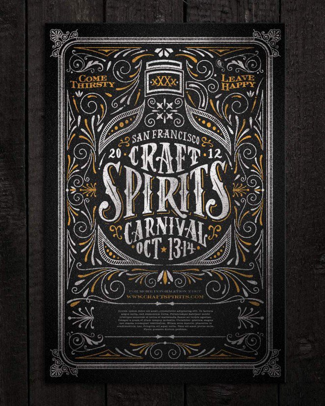
This flyer design oozes pure Americana.
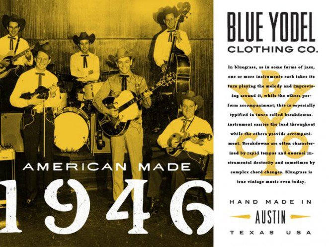
As does this one. It even makes the monochrome image work for it.
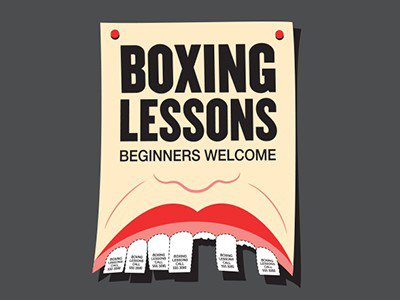
One of the wittier concepts for a flyer we’ve seen.
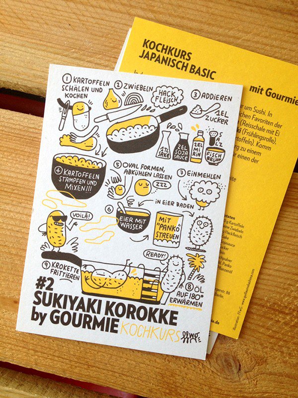
This whimsical flyer looks good enough to keep for its design alone.
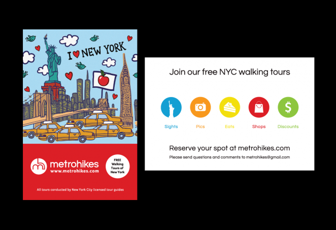
You may have seen these around NYC. Pretty basic, but everything just works.
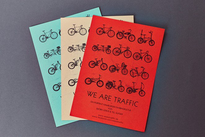
The repetition in this piece really makes these otherwise basic flyers pop.
What do you think is the best flyer design you’ve seen in 2016? Comment below.